Blue Shield of California | Medical Claims Upload | Mobile UX Lead
Medical Claims Upload
Blue Shield of California provides health plans for 4.5 million members and serves more than 65,000 physicians across the state.
The Problem
Blue Shield aimed to transform its mobile companion app into a digital platform that allows users to engage with services seamlessly and eliminate paper transactions. The medical claims upload feature would enable members to upload images of their bills via their mobile devices, add necessary details, and monitor the claim process throughout its lifecycle. This transformation would reduce processing time and clerical errors for members and decrease administrative, paper, and mailing costs for Blue Shield. Moreover, it would facilitate regular engagement with members and help the organization remain competitive in an increasingly digital healthcare landscape.
Users & Audience
Our user base of 4.5 million health plan members is highly diverse, with varying needs, technical skills, and demographic backgrounds, including age, education, language, and income. This diversity made designing for a specific member type or persona challenging. Additionally, we faced the challenge of shifting members' long-standing mental models of interacting with healthcare claims, which have traditionally been processed manually. Members typically engage with their plans only when they need specific assistance, rather than exploring the full benefits of their coverage.
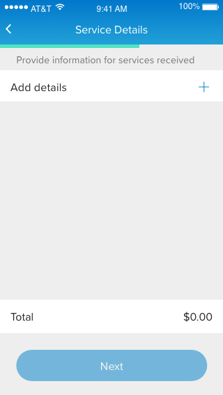
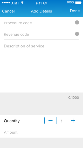
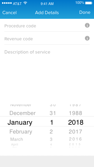
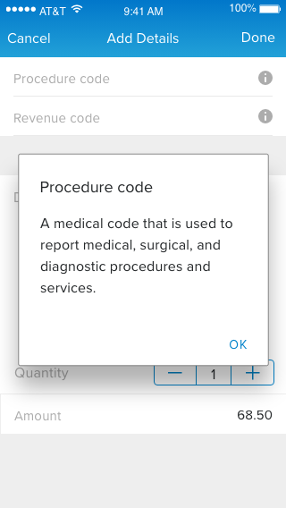
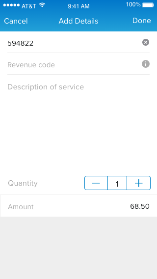
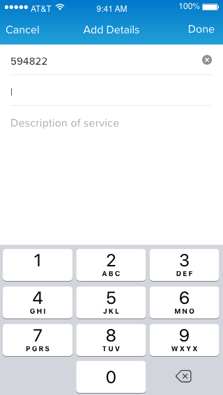
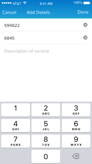
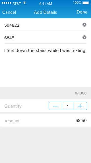
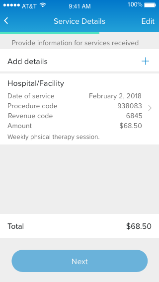
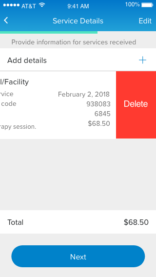
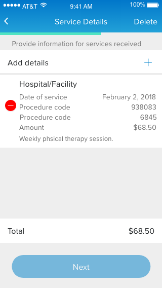
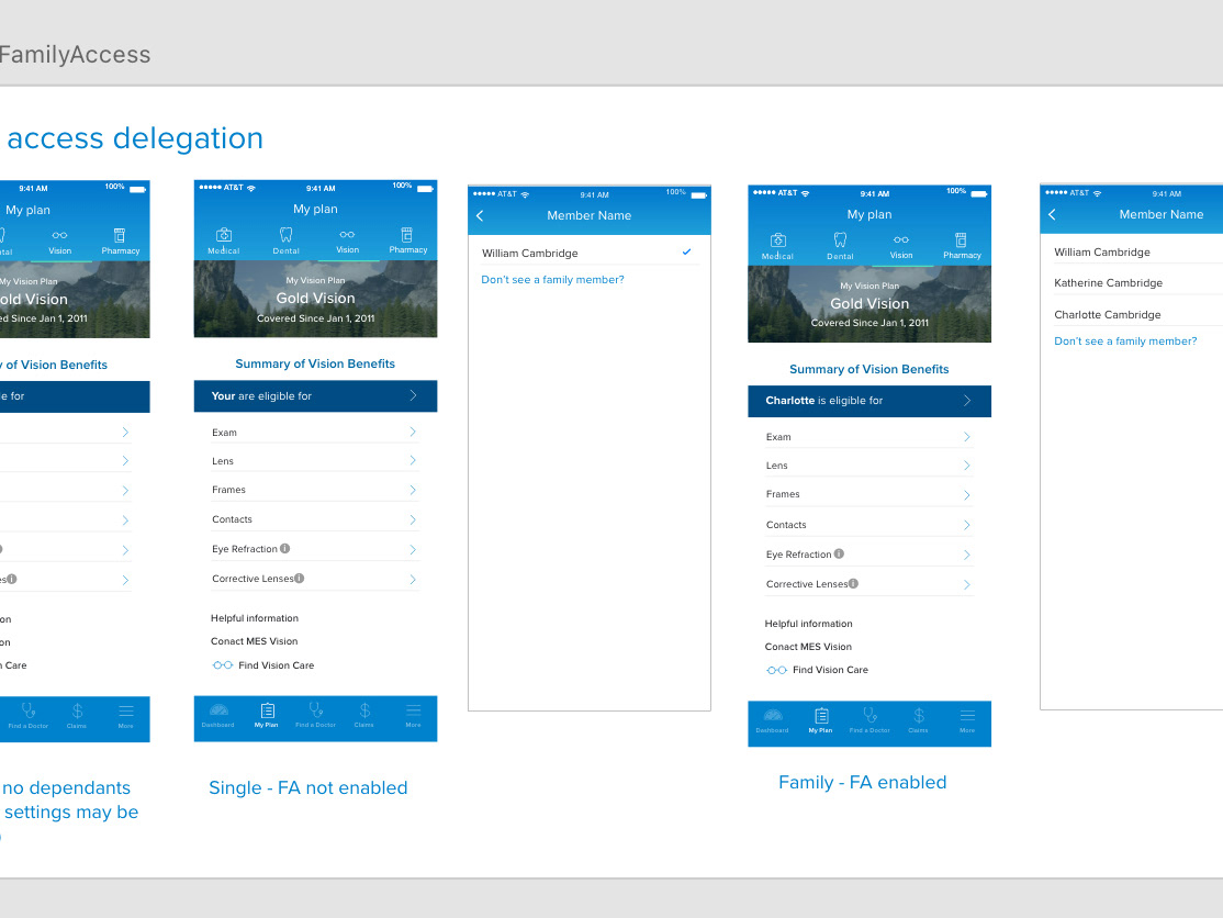
iOS Mobile Claims - service details flow
Team & Role
I was brought on board in an emergency capacity to lead the UX effort after an external design firm's development of the medical claims upload feature was not progressing well. Collaborating closely with the VP of Product and other stakeholders, I gained domain expertise to establish a clear strategy and design direction.
The implementation team included project management, UX designers, developers, QA specialists, and our Scrum Master. We followed an Agile framework with two-week sprints. My responsibilities encompassed creating all UX design assets (information architecture, user flows, wireframes, interactive prototypes, visual designs, and specifications) for development. As the UX lead, I oversaw the implementation process and approved all UX elements.
I also partnered with User Research to integrate regular user testing sessions into our workflow, using various methodologies (user interviews, low-fidelity mockups, interactive prototypes). Validating our design direction with user insights was crucial.
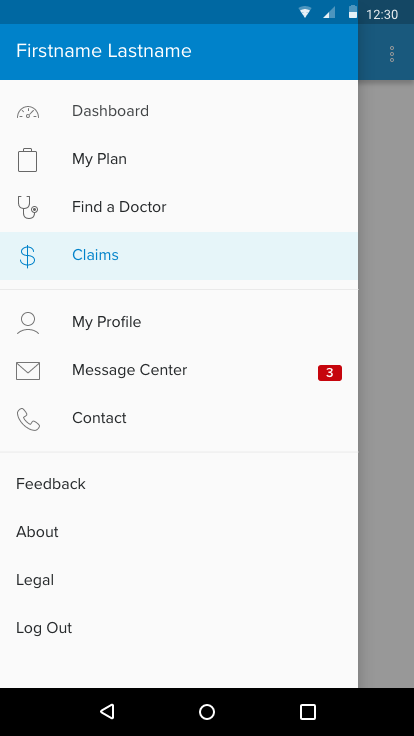
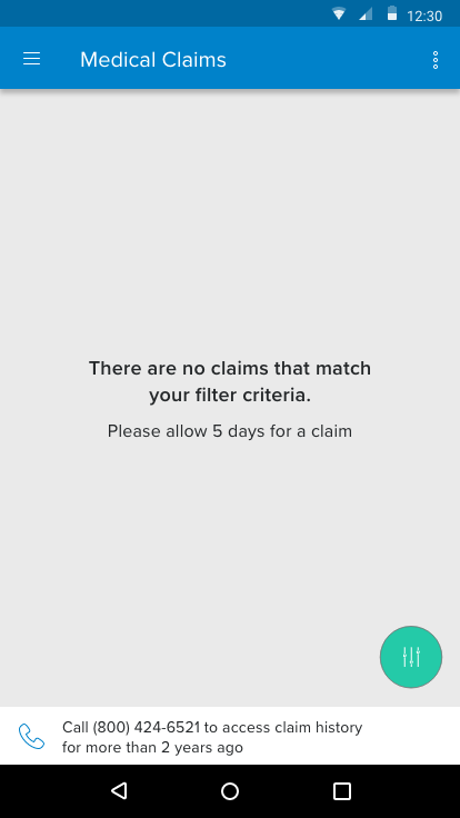
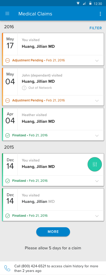
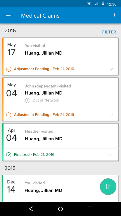
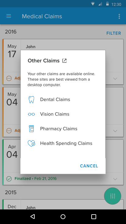
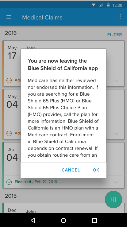
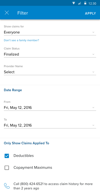
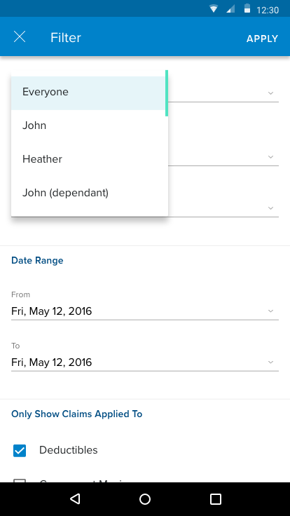
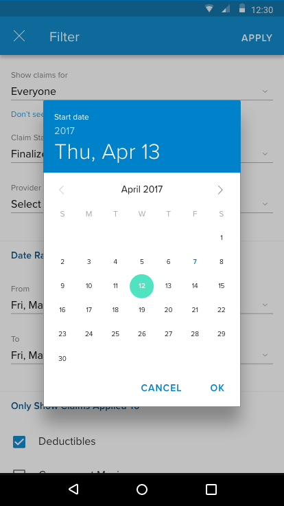
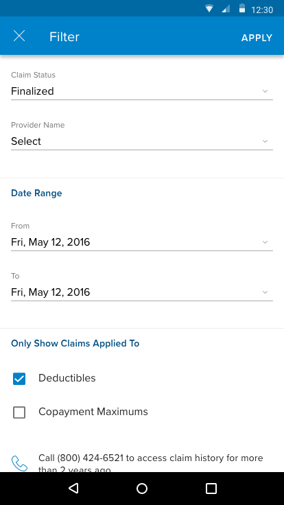
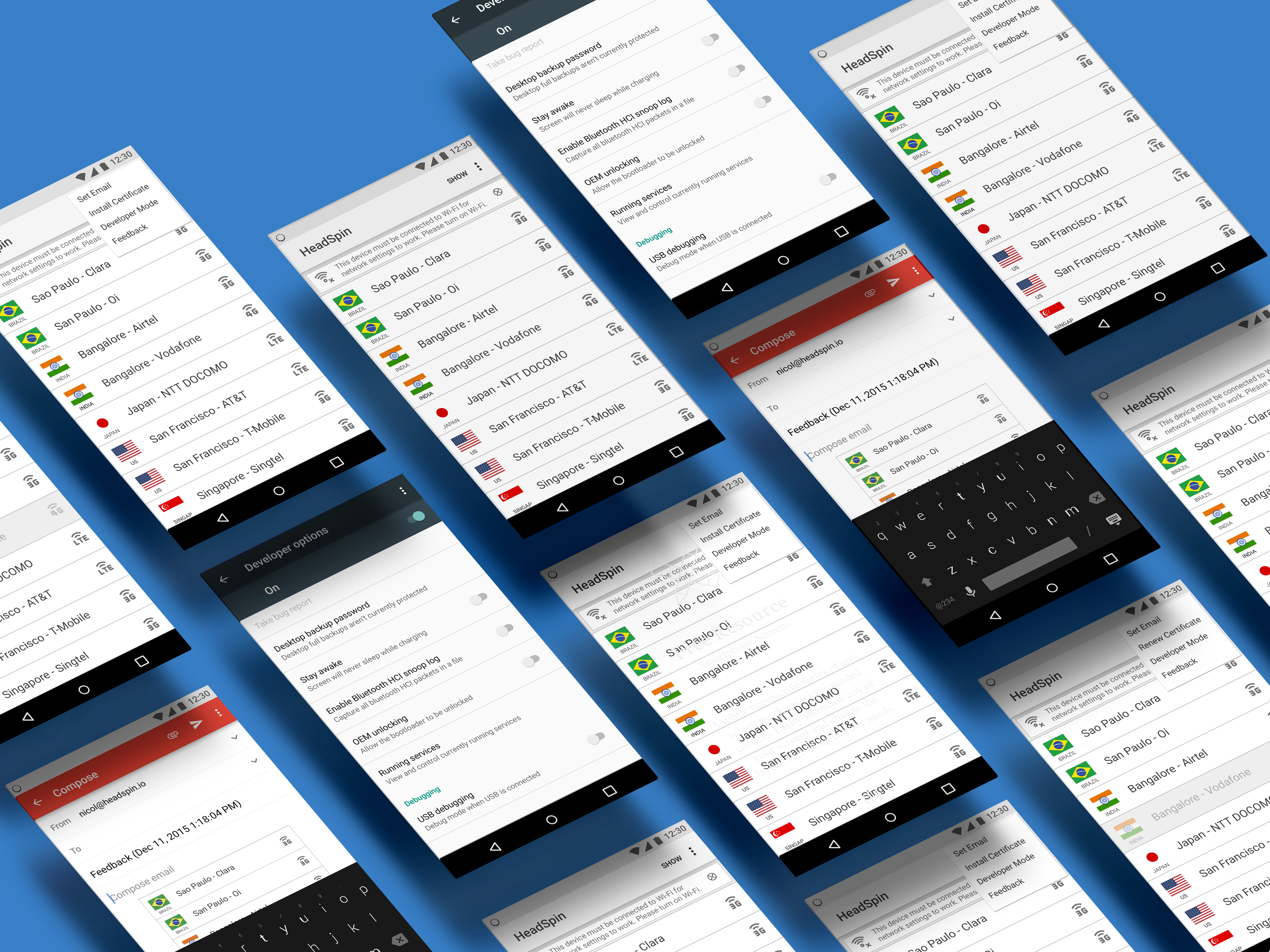
Android Claims - initial flow
Design Process
My design process begins with understanding the overall system and its constraints. Business goals were clearly defined: Blue Shield wanted to create a digital platform to allow members to upload medical claims, reducing customer service calls and increasing member satisfaction. Given that claims are the primary driver of these calls, this feature was prioritized as a key opportunity to engage our member base and enhance the app.
After gaining domain expertise in medical claims and the necessary information, I started the design process by breaking the feature into smaller components based on claim types. This template-based approach allowed for component reuse and a more intuitive model for users.
Wireframes were the first design asset developed, focusing on testing the workflow without visual distractions. I conducted guerrilla testing within the office, leveraging feedback from employees who are also Blue Shield members. As the feature progressed, user testing became more formalized, incorporating user interviews and interactive prototypes to gather insights and refine design decisions.
Findings
Designing in the healthcare sector presents challenges due to strict regulations and the need to maintain patient privacy in compliance with HIPAA guidelines. This impacts the overall flow and display of sensitive information. Additionally, changing long-standing perceptions about medical claims processing to include a digital solution was complex. However, providing members with quicker access to their funds significantly increased engagement with the medical claims upload feature.
Initially, user testing was not prioritized in the design process. My experience underscored its importance in validating design direction. With limited time and budget, I utilized guerrilla testing techniques involving Blue Shield employees who were invested in the claims feature. The findings challenged some assumptions and led to significant improvements in the design solution. This feedback loop became a vital component of our future design processes.


