HeadSpin, Inc. - Google Ventures | Mobile Companion Design | Manager of UX
The Mobile Companion
HeadSpin, a global testing platform, helps developers pinpoint the customer experience and application performance issues with real-time visibility in over 140 countries.
The Problem
The HeadSpin platform needed to seamlessly communicate with the mobile companion. The basic requirements were to allow developers to change settings on the mobile device, record the session, and send data back to the platform for analysis. Although the requirements lacked definition, the expectations from stakeholders were crystal clear; develop a stellar product that would be embraced by the Google development community.
Users & Audience
Since HeadSpin was a Google Ventures startup, the initial users consisted of a forum of Google developers. This highly technical group held very specific ideas of how a performance tool should function within their workflow. Furthermore, as heavy Google users, they wanted something that felt familiar and seamlessly integrated into their workflow. The target audience would be developers who use Google Development Tools. We cast a large net with the expectation that we would not only convert but engage a large segment of that audience.


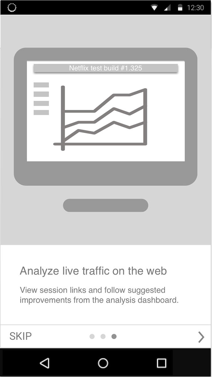
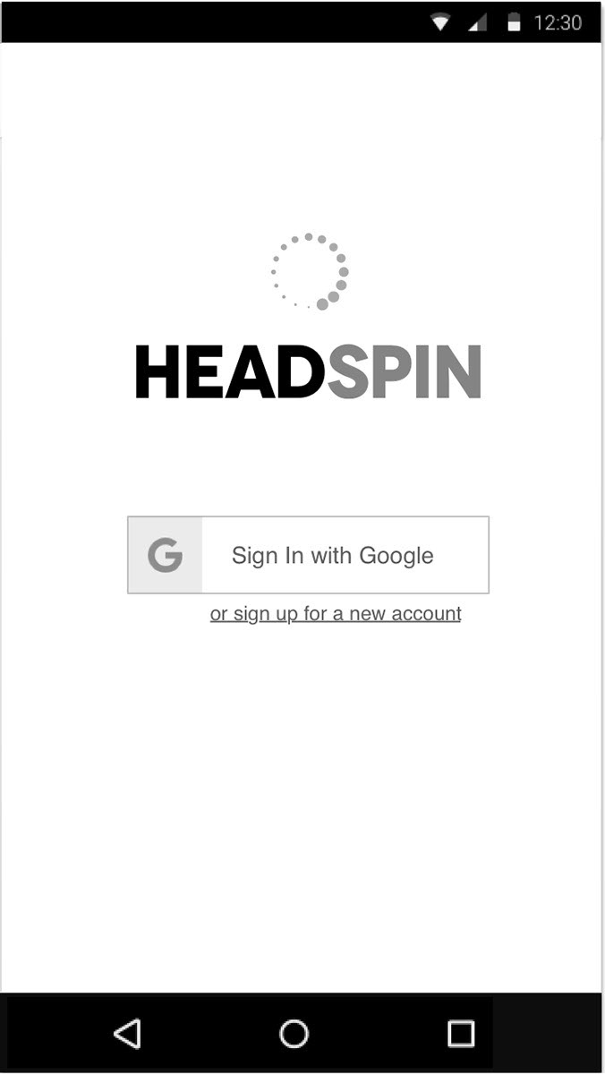
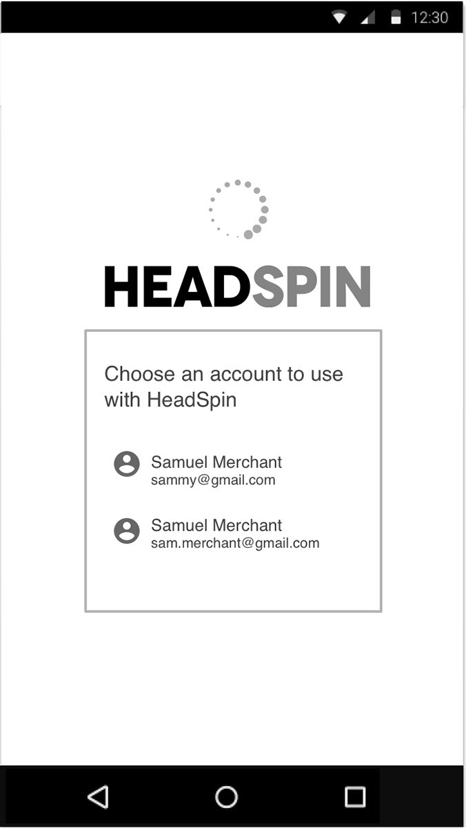
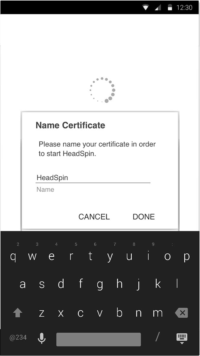
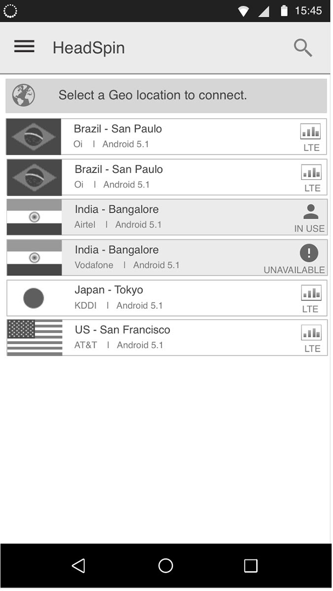
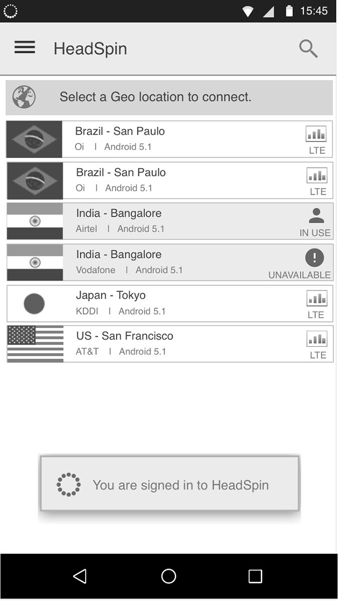

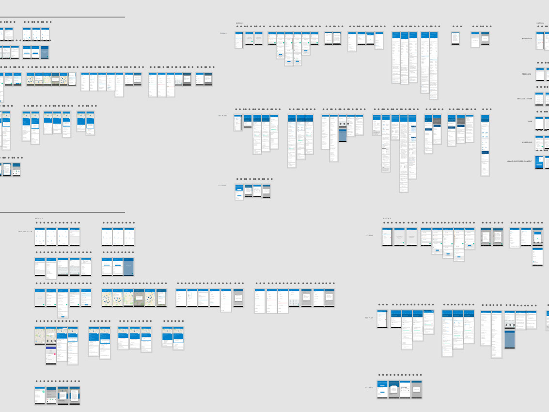
Onboarding wireframes - user flow v. 2.0
Team & Role
I joined HeadSpin as the UX Manager (employee #6) and was responsible for creating a product design strategy that aligned with the business goals and worked closely with the CEO and CTO to achieve this goal. I created all of the design assets (IA, user flows, wireframes, prototypes, visual design, and specs) to help inform design decisions. I engaged our user forum to conduct several user interviews with Google developers.
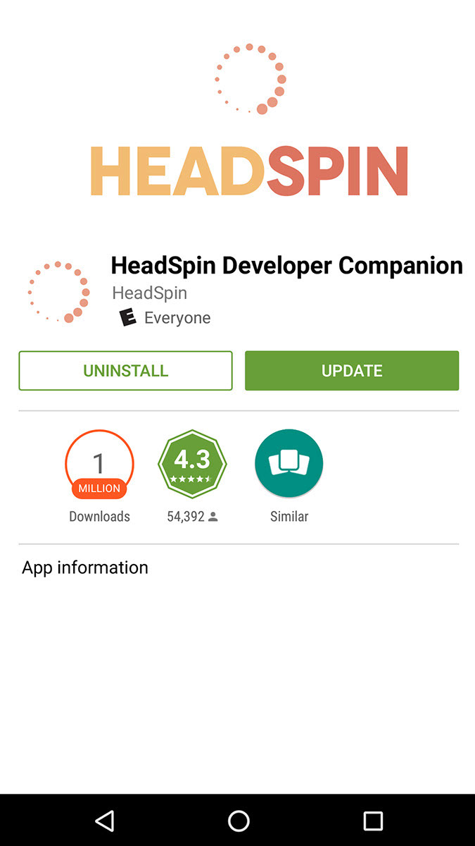
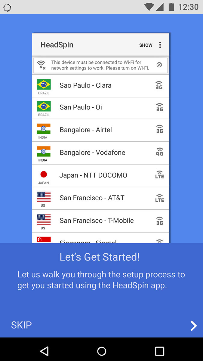
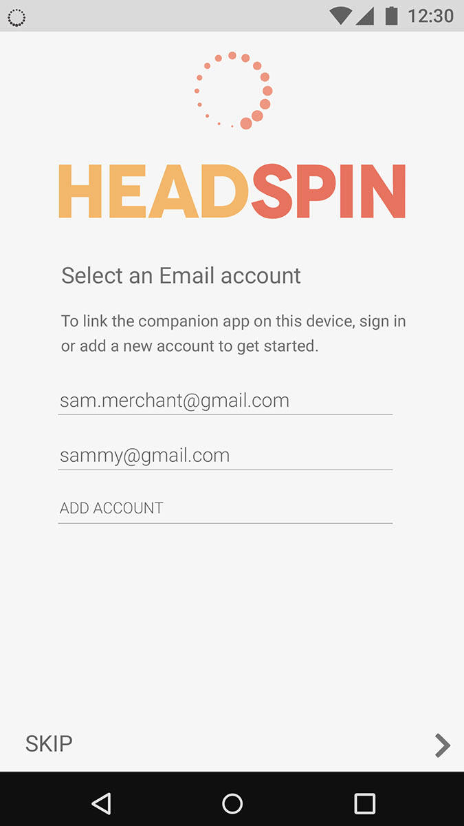
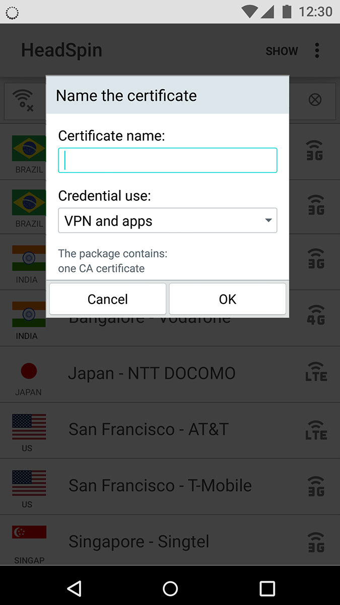


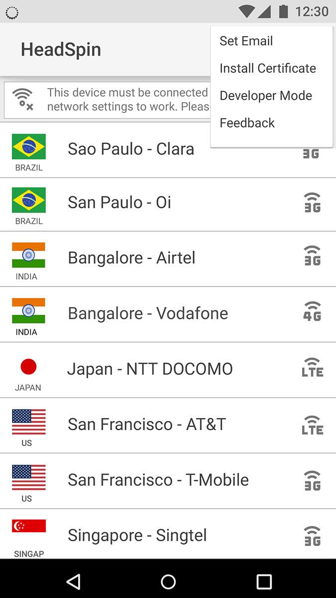
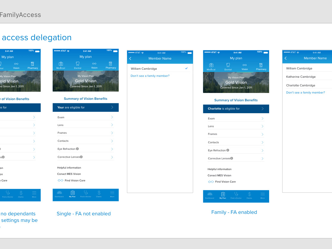
Mobile Companion - high fidelity mockups
Design Process
My process always begins with understanding the overall system and any constraints before making decisions. In this case, I needed to understand the dashboard architecture, functionality and how the data points were displayed and consumed in order to inform any design considerations. What decisions could I support with metrics or research from our forum?
I prioritized a feature set based on the user stories outlining the pain points with testing and workflow from developer interviews. From there the team agreed on our initial MVP candidate. I started creating wireframes using Sketch to support our design decisions. This informed the product strategy direction for the CTO and CEO.
I prioritized a feature set based on the user stories outlining the pain points with testing and workflow from developer interviews. From there the team agreed on our initial MVP candidate. I started creating wireframes using Sketch to support our design decisions. This informed the product strategy direction for the CTO and CEO.
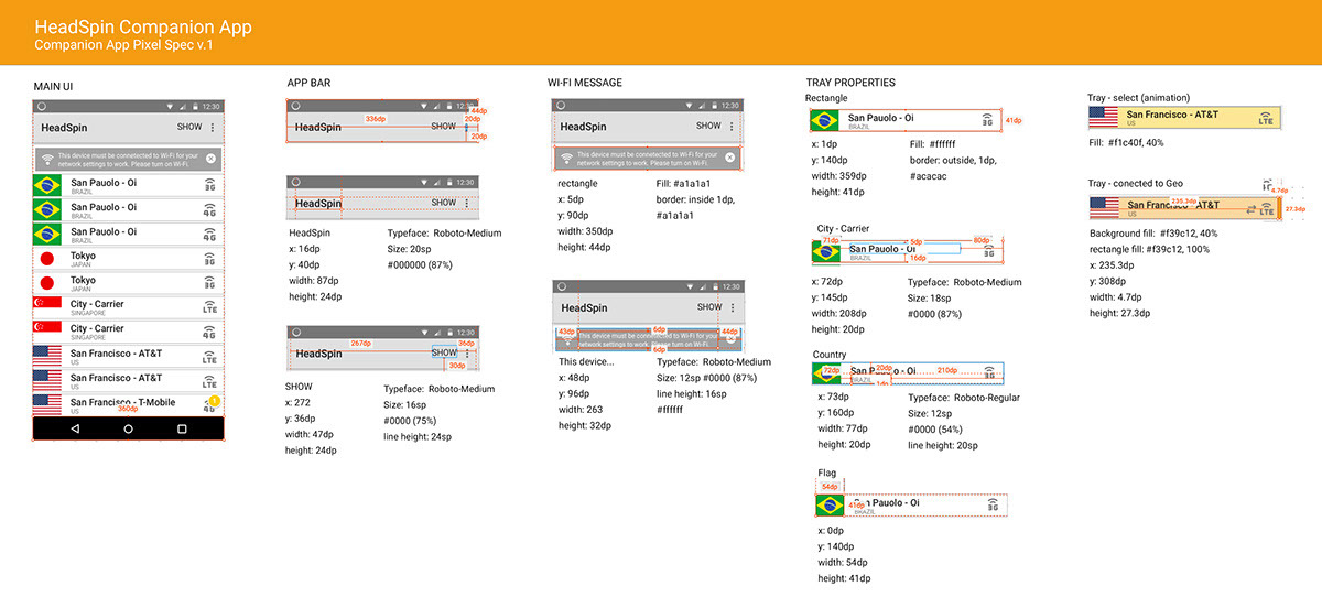

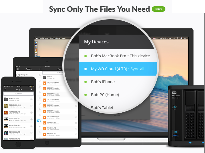
Mobile Companion - pixel spec samples
Findings
Working for a startup I needed to make quick design decisions based on little information since there were no other competitors in the marketplace. I found information wherever available and learned to leverage my experience as a UX professional and rely on specific training to solve immediate design challenges.
Designing for the developer “persona” proves quite different than designing for other user types. I found that developers tend to have specific ideas in mind for how their tools or products function. Unconsciously, they are constantly thinking of how to improve the user experience; as a result, the information they provide is informed and very specific.
At the start of the project, the Mobile Companion was working technology with a minimal UI designed by our CTO. Once the UI was fully designed and additional functionality was added, we saw the user forum engagement increase by over 50%. The number of interactions and time increased significantly because our users were able to experience how the Mobile Companion app was designed to interact with the HeadSpin platform.


