Blue Shield of California | Benefits: Medical, Dental & Vision | UX Lead
Benefits: Medical, Dental & Vision
Blue Shield of California provides health plans for 4.5 million members and serves over 65,000 physicians nationwide.
The Problem
As part of our efforts to expand the Blue Shield digital platform, we aim to add medical benefits as a new feature. Many members have expressed frustration about not knowing which services are covered and the associated out-of-pocket expenses. Previously, this information was only available online in a PDF format that was difficult to navigate, leading to an increase in customer service calls. By integrating this information into the platform, we can enhance member engagement and enable them to derive greater value from their plans. Additionally, this initiative will deliver immediate ROI by reducing call volumes and supporting a "go green" initiative to cut printing costs.
Users & Audience
Our diverse user base of 4.5 million health plan members in California presents a wide range of needs and technical skills, influenced by factors such as age, education, background, language, and income. This diversity makes it challenging to design for a specific member persona.


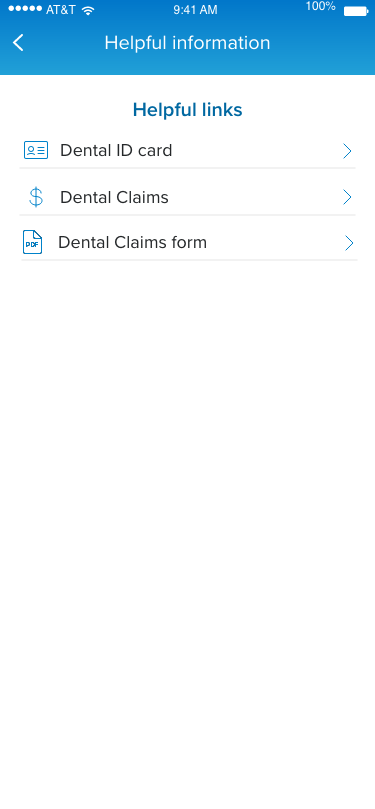
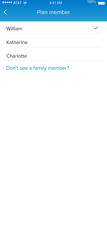

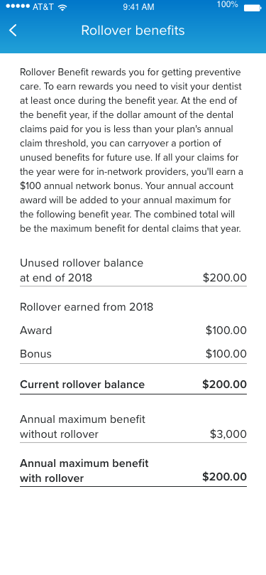
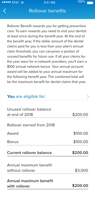
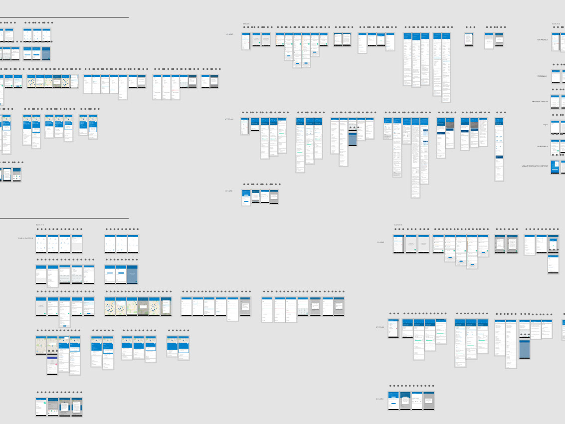
Android Dental PPO benefits - user flow
Team & Role
UX Lead
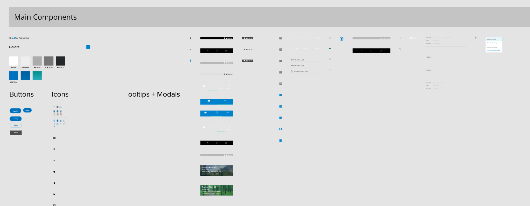
Design Library - Mobile Design Components
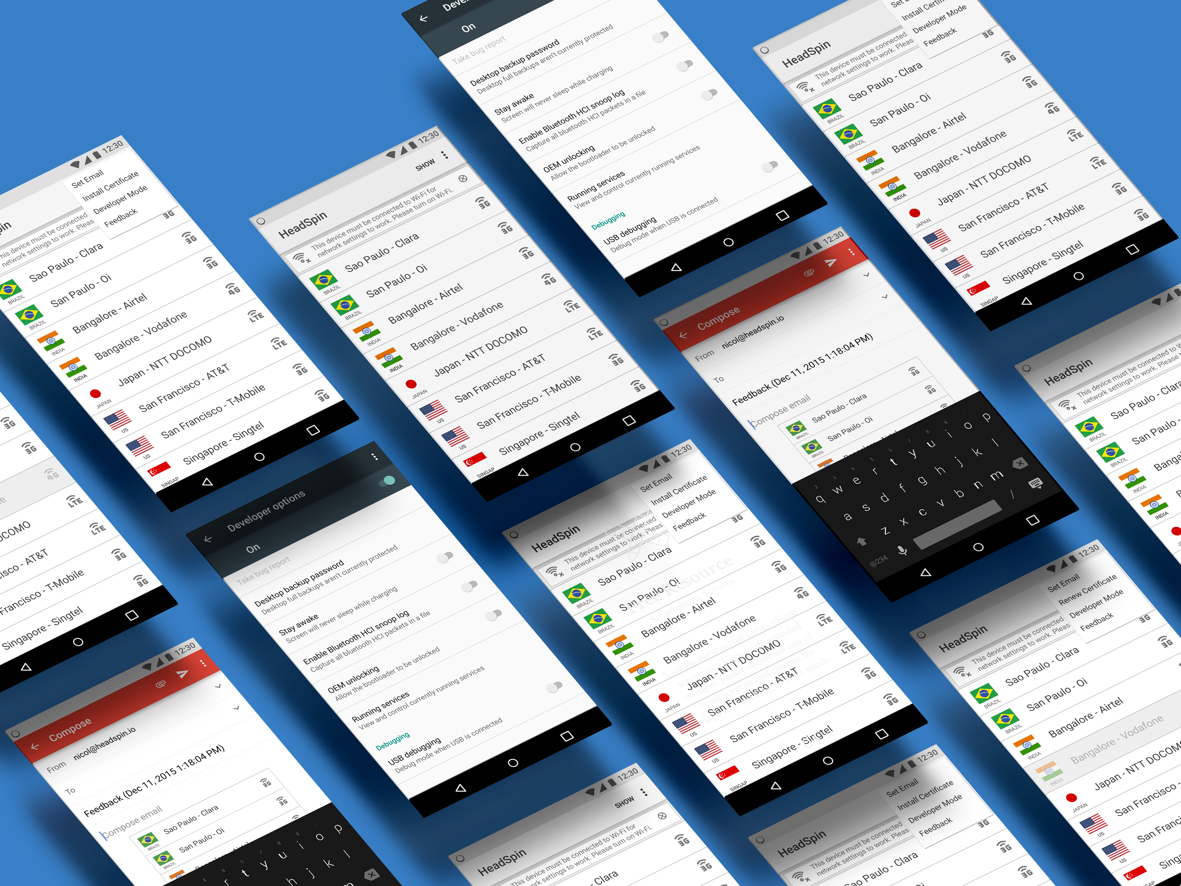
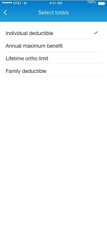
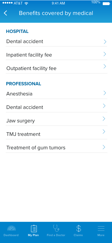
Mobile Companion - high fidelity mockups
Design Process
My design process begins with a thorough understanding of the overall system and its constraints. In this instance, the business goals were clearly defined: Blue Shield sought to create a digital platform enabling members to upload medical claims, thereby significantly reducing customer service calls, lowering overhead, and enhancing member satisfaction. Since claims are the primary driver of customer service inquiries, this feature was prioritized as an optimal opportunity to engage our member base and evolve the companion app into a comprehensive digital platform.
Findings
The healthcare industry is highly regulated, presenting numerous challenges in creating effective design solutions. Ensuring patient privacy is paramount, and adherence to HIPAA guidelines is essential. These regulations influence how sensitive information is displayed and managed. Additionally, changing long-standing mental models associated with traditional claims processing can be difficult. However, providing members with quicker access to their funds has proven to increase engagement with the medical claims upload feature.
When I joined the team, user testing had not been prioritized in the design process. My experience underscored the importance of user testing in validating design direction. Faced with limited time and budget constraints, I leveraged the presence of Blue Shield employees who were invested in the claims feature. I implemented various guerrilla testing techniques throughout the process. The insights gained not only challenged some of our assumptions but also led to significant improvements in the design solution. This feedback loop has become a critical component of all future design efforts.


